If you are building Microsoft Sentinel workbooks and want to provide some interaction, you’re probably familiar with exporting parameters from your queries. When using the default grid/table visualization, it’s pretty straightforward - the field is the column name you wish to export. However, the process to export parameters from a chart is not so obvious. This post walks through how to export chart parameters in your Sentinel workbooks.
Setting up your chart
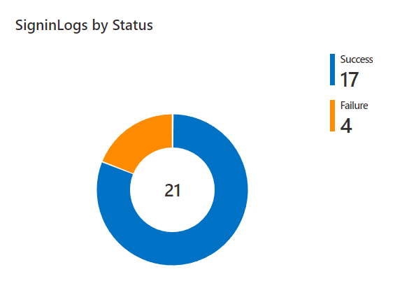
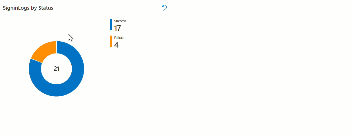
For this example, I’ll be creating a pie chart query item that shows the number of Successful vs. Failed Azure AD sign in events. I want to be able to interact with the pie chart by clicking on a value and seeing the raw events. I’m using the following KQL query:
SigninLogs
| extend Result = iff(ResultType == 0, "Success", "Failure")
| summarize count() by Result
This gives me the following pie chart:
Next, go to the advanced settings menu. Check the box for ‘When items are select, export parameters’. If you’ve worked with exporting parameters before, you might think that you’d use the “Result” column from the query above - not quite the case with charts.
Working with chart fields
If you hover over the information icon next to ‘When items are selected, export parameters’, you’ll see the following:
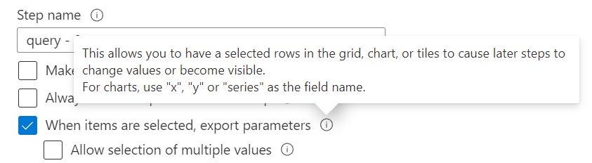
Note the point about field names for charts - you’ll see how this is used later. Click ‘add a parameter’, then hover over the information icon next to ‘Field to export’:
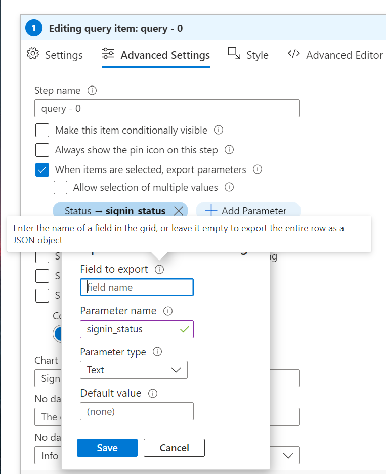
Notice that it says the entire row will be exported as a JSON object if left blank. What does that look like? To see, I save the parameter and add another query item to the workbook. In I use a print statement in the query to view my new ‘signin_status’ parameter:
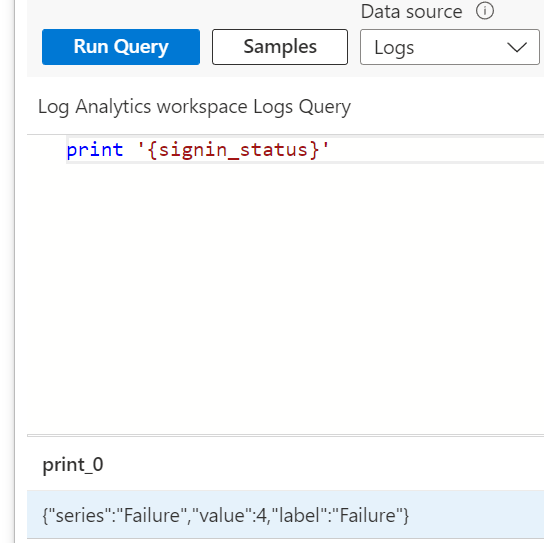
Here I can see the fields available to me after selecting the ‘Failure’ value in the pie chart. As mentioned in the query item advanced settings menu, I can use the “series” field to export the value I’m really looking for.
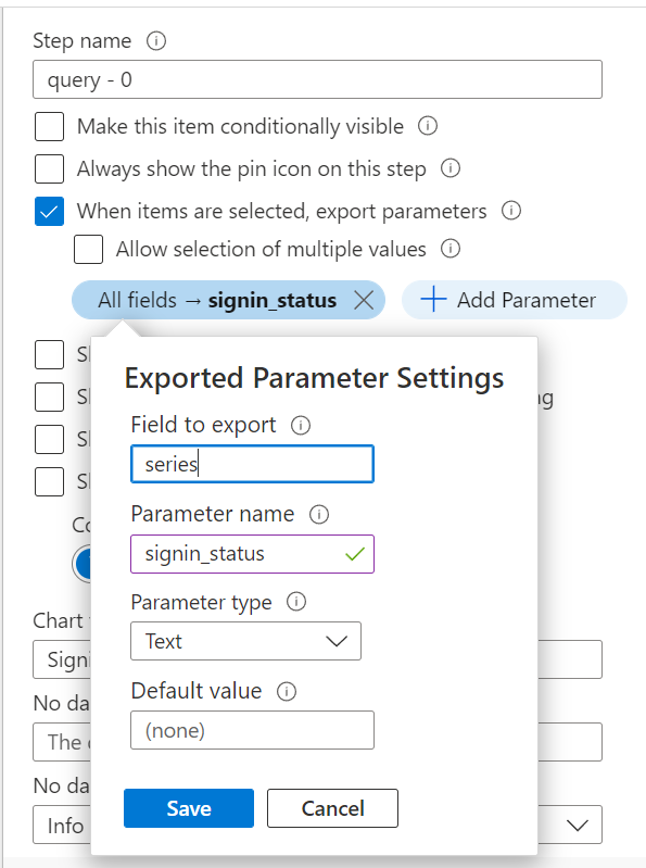
Exporting the chart field
Now that I know which field to use, I update my exported parameters settings by setting the ‘Field to export’ value to the ‘series’ field:
Once again I print out my ‘signin_status’ parameter:
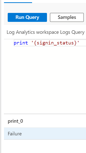
Success! I can now setup any additional query items in my workbook that will take this parameter. In the example below, I use the following KQL query to filter on my ‘signin_status’ parameter and set the query items to be conditionally visible if the ‘signin_status’ parameter is set:
SigninLogs
| extend Result = iff(ResultType == 0, "Success", "Failure")
| where Result == '{signin_status}'
| project TimeGenerated, Identity, ResultDescription
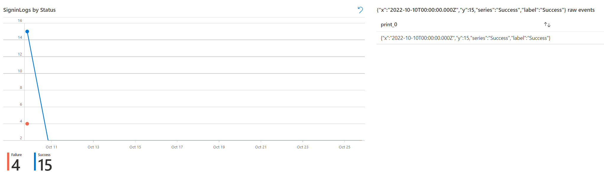
Now when I click on a value in the pie chart I see only the matching events in my new grid/table:
Charts with x and y values
Other chart types may have different exportable fields. For example, the x and y values in line and bar charts can also be exported:
Summary
If you’re looking to add some interaction to your workbooks with charts, be aware that exporting parameters works a little differently when compared to a simple grid/table where the field matches the column name.